Design Overview
Color System
The PPL color system is built on contrast, warmth and subtle control. It balances strong, grounded tones with refined accents, creating a visual language that feels both powerful and effortless.
Rather than relying on loud or overly saturated colors, the palette focuses on depth and nuance. Each tone is carefully selected to work seamlessly together, supporting clarity while maintaining a sense of exclusivity.
This approach allows the brand to remain consistent across all touchpoints. The colors create a calm but confident presence, reinforcing PPL’s identity as precise, elevated and intentionally curated.
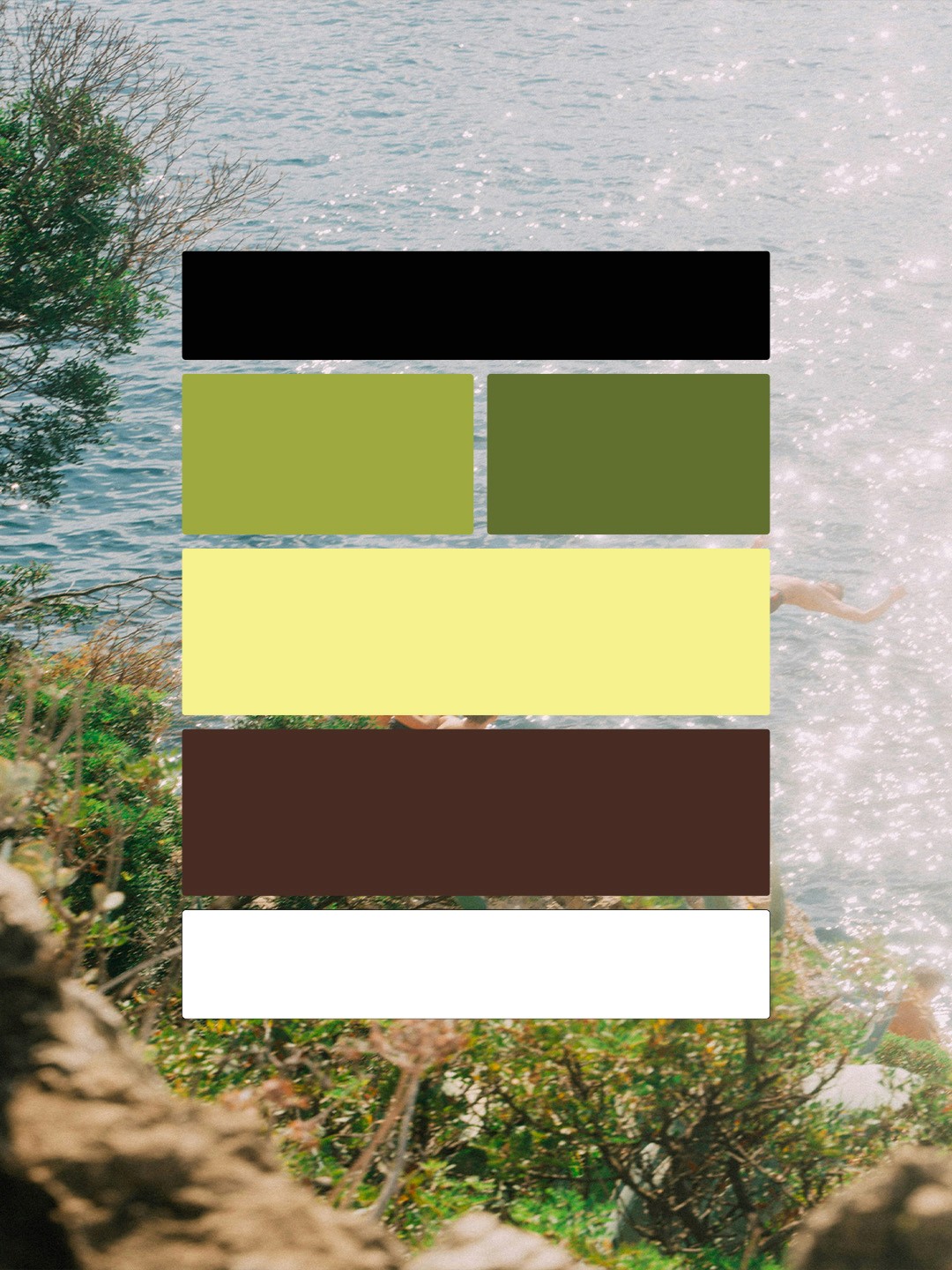
Black
HEX: #000000
RGB: 0, 0, 0
CMYK: 85, 64, 43, 39
Artichoke
HEX: #9EA93F
RGB: 158, 169, 63
CMYK: 46, 18, 99, 3
Olive
HEX: #617030
RGB: 97, 112, 48
CMYK: 65, 36, 100, 25
Butteryellow
HEX: #F5F18D
RGB: 245, 241, 141
CMYK: 8, 0, 61, 0
Walnut
HEX: #51301F
RGB: 72, 44, 35
CMYK: 43, 73, 71, 68
WHITE
HEX: #FFFFFF
RGB: 255, 255, 255
CMYK: 0, 0, 0, 0