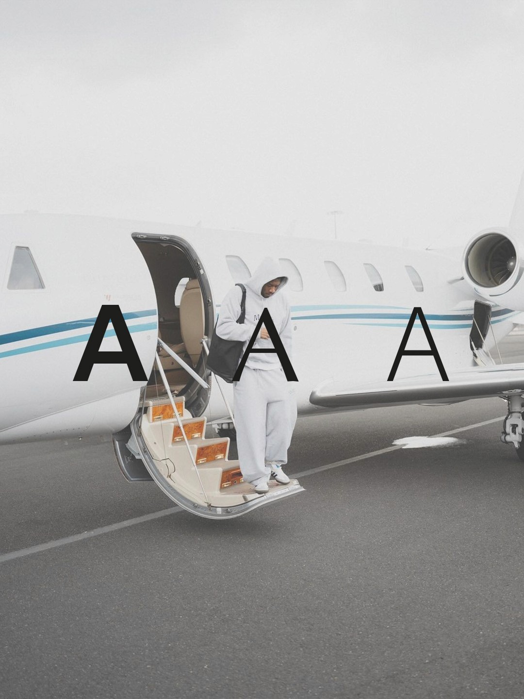
The typography is designed to reflect clarity, control and quiet authority. It balances precision with elegance, creating a visual language that feels structured yet effortless.
Rather than relying on overly expressive or decorative styles, the system focuses on refined proportions, clean spacing and confident simplicity. This ensures readability while maintaining a strong and distinctive presence.
The combination of typefaces allows for contrast between authority and accessibility. Headlines communicate direction and presence, while body text delivers information with ease and clarity.
This approach supports the overall brand experience by making every message feel intentional, controlled and consistently elevated.