Design Overview
Logo Concept
The PPL logo is inspired by the Pegasus, a symbol of elevation, speed and access beyond limits. It represents the ability to move effortlessly between worlds and connect people, places and opportunities.
Instead of a rigid geometric form, the logo follows an organic and fluid direction. The soft curves and natural movement create a sense of lightness and precision, reflecting how PPL operates.
This approach sets PPL apart from typical corporate aesthetics. The mark feels controlled and powerful while remaining effortless and human.
Logo Variations
Full Logo
Logo
Monogram
Brandmark

Construction Grid
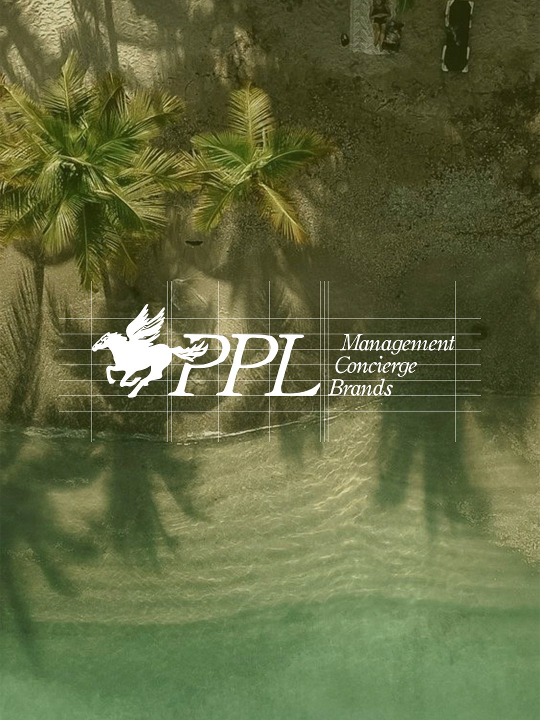
The logo is built on a structured construction grid to ensure precise alignment, balance and consistency across all applications
Each element follows defined proportions, creating a clear and controlled visual rhythm
This system allows the logo to remain stable and recognizable at any scale and in every context
Clear Space
The logo is placed within a defined grid to maintain consistent spacing and visual balance
Clear space around the logo is derived from its own proportions, ensuring it remains isolated and impactful in every application
This system guarantees legibility, structure and a refined presence across all formats
Incorrect Usage
The logo must always be used as defined within the system to maintain clarity and consistency
Do not alter colors, proportions or spacing, and avoid adding effects or surrounding elements
Incorrect usage weakens recognition and disrupts the refined, controlled presence of the brand